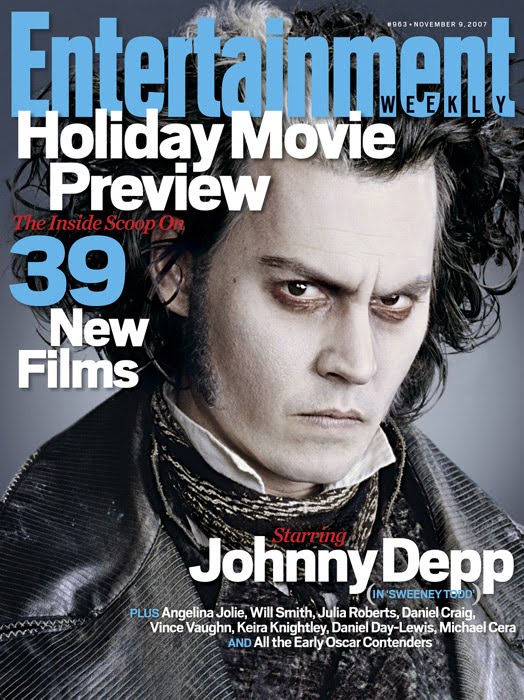
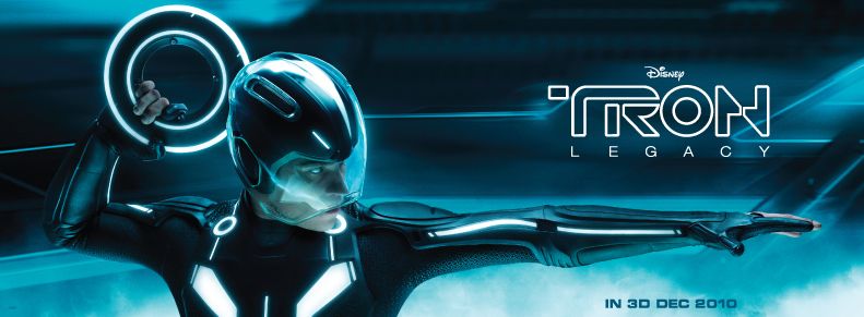
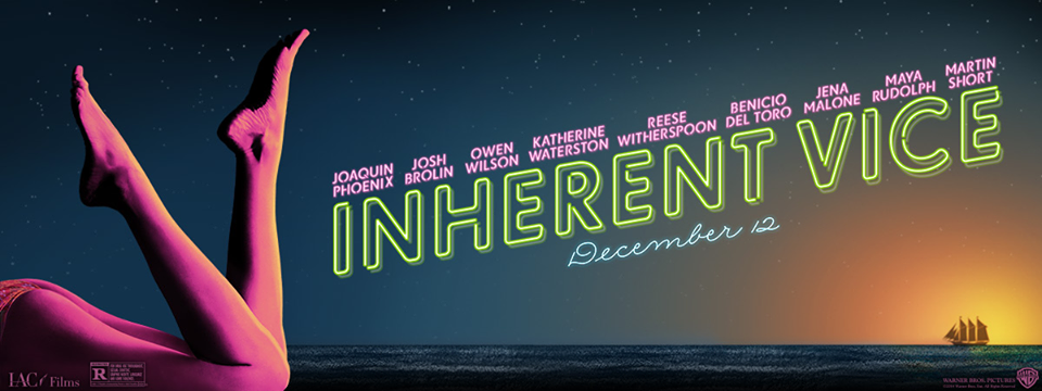
Friday 27 January 2017

Movie magazine masthead design

Here are some pre existing movie magazine mastheads that I have researched before I go on to create my own masthead designs. Conventions of these mastheads are:

  • Bold, large font
  • One word titles
  • Words to do with film or the film industry
  • Red colour schemes or the colour red featuring somewhere on the title
  • On three of the covers, the title covers the main image in the background, although one incorporates the person in the foreground.


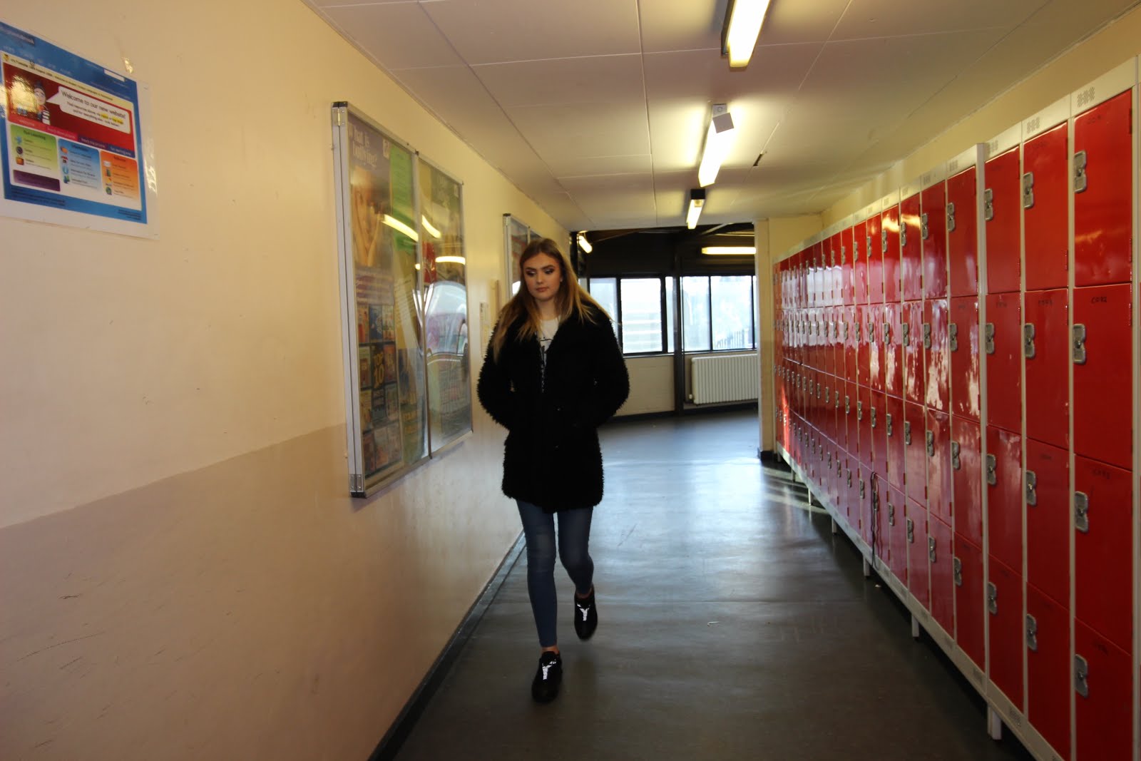
Here I have created a few examples of a magazine masthead on sketch. These are just a basis before I get some peer feedback as to which one is the best style, and should be used on my magazine cover. I chose the word 'feature' to fit with the conventions of the above mastheads. Feature is a word for a film at length, so  it fits perfectly with the magazine content.

Tuesday 24 January 2017

Film magazine research

Here I have analysed the cover of a popular film magazine to find the conventions. I have also looked and inserted covers from other types of movie magazine, ranging from popular to more indie. This is a good reference point for when I begin to design and create movie magazine covers featuring Happening Upon Luna


Image result for film magazine covers

Image result for indie movie magazine covers

Image result for film magazine covers

Here are some billboard examples that I have also collected so that I can get an understanding of the format of the poster style.

Image result for movie billboard posters

Image result for movie billboard posters

Image result for movie billboard posters

Features of the billboard are:


  • Simple main image, of either the main character of a featuring character
  • Less writing than on the official poster
  • Bold title, which is the main feature on the poster, so that it can be seen from far away.
  • 'Taken' features a tagline
  • Consistantb colour scheme

Tuesday 17 January 2017

Film Poster ideas

For one of the shots in out trailer, Luna sees a poster for the film competition that both her and Tessa are entering. This poster is important as it gives the audience the first impression on what the film is about. Using Canva, I have designed two film posters that can be used in the scene. Canva is a new technology that I have discovered that allows you to create simple and professional looking posters or presentations with ease.


After some deliberation, I have decided to choose the first design that I created in my shot. This is because it is easier to read and the picture of the camera will help easily indicate that it is a filming competition. I also asked my peers for some feedback on which one they preferred and all 3 agreed with my choice to go with the first design. I will now print this out in preparation for filming.


Practice photos before filming

Before we being filming tomorrow, we decided to take some simple shots so that we have a basic understanding of some long shots and close ups before we start filming. This was also helpful as of our shots are actually going to be filmed in these school corridors, so now we have an idea on what what parts of the school we might shoot in.